Digital magazines can either be a joy to read or a burden.
It all depends on the design of the content and the underlying technology.
In this article, we showcase 9 high-quality digital magazine examples—each with something interesting to teach us about how to design and format content for digital screens.
We don’t recommend creating a digital magazine by embedding a PDF into your website because PDF files are very hard to read online using any device. Readers have to pinch and zoom their way around the page to read columns and sections.
Instead, we’ve hand-picked digital magazine examples that use modern, mobile-optimized technology—mostly using our web-based reader, but also within native apps and Apple News+—so you can see examples that offer a great reading experience.
And at the end, we offer key takeaways from the examples to serve as a checklist when creating your own digital magazine.
1. TIME for Health
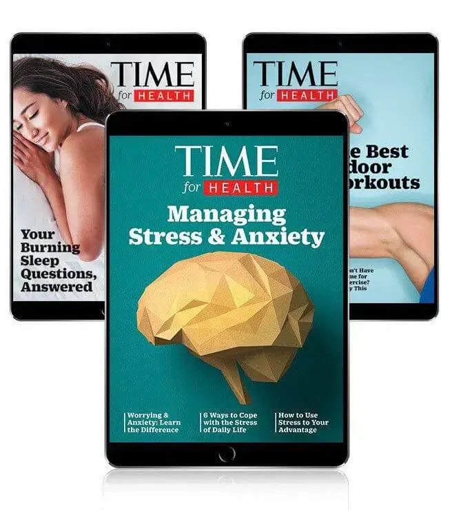
We kick things off with some bold and simple full-screen digital covers from TIME for Health. One of the most popular magazines in the world, TIME offers free digital health and wellness magazines. There are a variety of special issues that each cover a specific topic like sleep, diet, habit-building, and anxiety. Not only are these issues examples of high-quality digital magazines, but they also serve as an example of giving away free content to grow brand awareness and subscriptions for premium content.
2. Outdoor Photographer
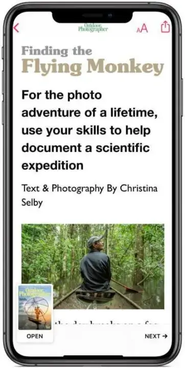
In this example, Outdoor Photographer is shown inside Apple News+, a monthly subscription to more than 300 magazines and newspapers. As you can see, content is shown in a single column so it’s easy to read on any device. At eMagazines, we offer support to Apple News+ publishers, handling content design and delivery on your behalf.
3. Esquire
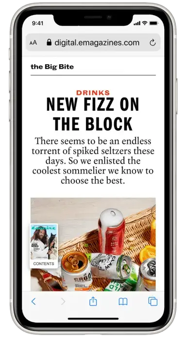
In this example, we see Esquire’s branding evident in the font style and color, while the background is kept clean and simple. At any time, readers can click on the magazine cover to be taken to a Table of Contents widget that makes it easy to navigate through the different articles.
4. Entertainment Weekly
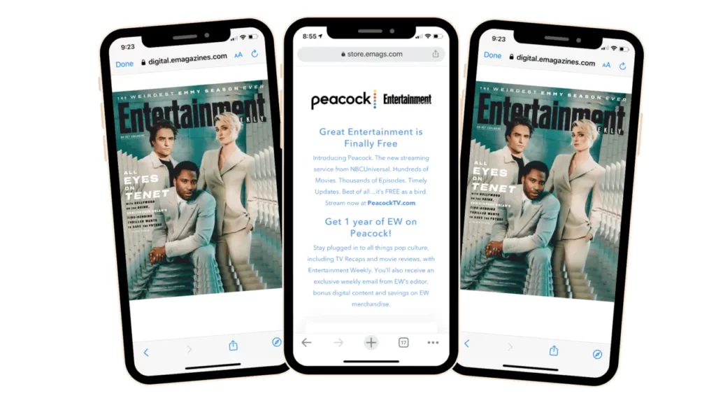
Entertainment Weekly offers the best entertainment industry content across movies, TV, books, events, and celebrity news. In this example, we can see what ads look like in digital magazine format. Ads are shown full screen to give them the attention they deserve without detracting from your main content. Readers can easily swipe past ads to keep reading.
5. Good Housekeeping UK
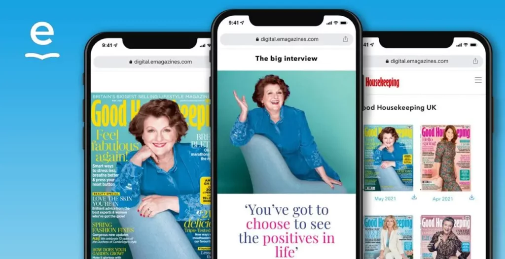
Good Housekeeping UK offers another example of a digital magazine. Here you can see the cover feature shown in a mobile device. The magazine’s branding is evident in the font style and color, but the white background and single-column format remain. Why? This design is the easiest to read on laptops, phones, and tablets. The content will automatically fill the screen, no pinching or zooming required.
6. Sports Illustrated
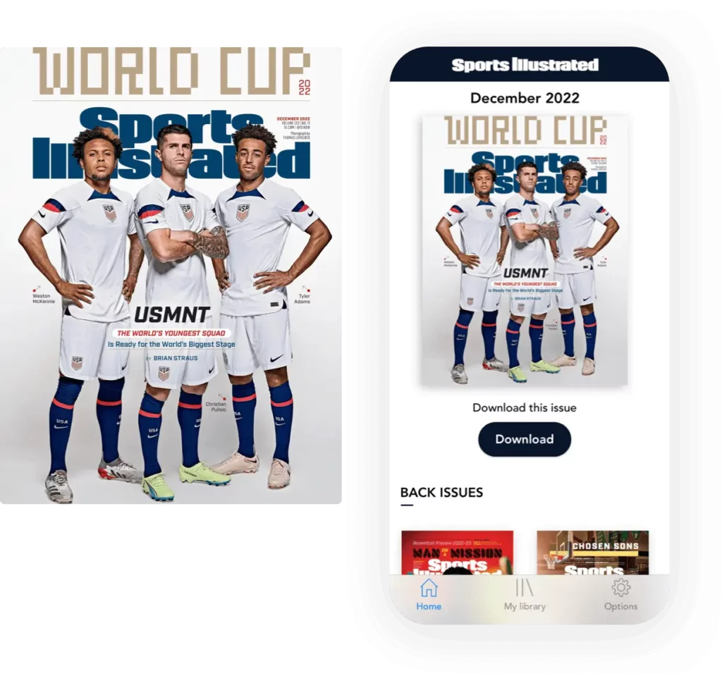
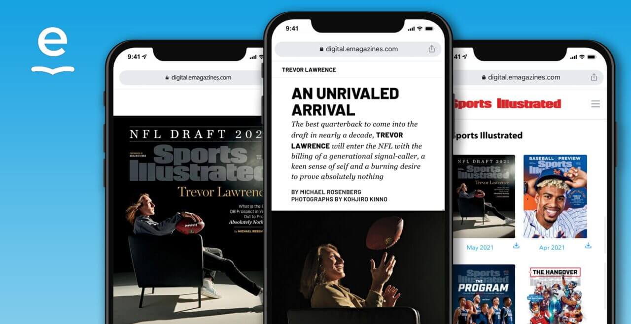
Sports Illustrated offers a great example of digital magazine content inside its native mobile app. Readers can view back issues and download content to their devices for offline reading.
Keep in mind that most publishers don’t need a branded mobile app, and you should only create one if you have a solid plan for content and profitability. Most publishers are better off releasing digital magazine content via a web-based platform that doesn’t require passwords or downloads.
7. Better Homes & Gardens
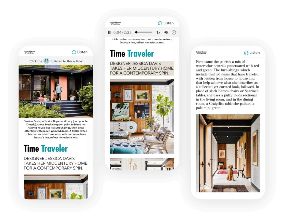
Better Homes & Gardens offers a great example of a digital magazine that includes audio for every article. With 73% of Americans over the age of 12 listening to audio content at least monthly, it’s a good idea to offer audio versions for all of your content. If you use digital magazine software with AI audio generation, all you need to do is upload the print file of your magazine and choose an on-brand real human voice. The software will then reflow your file into a digital magazine and add the audio file at the top of every article. You can then test each audio button before publishing the magazine and distributing it to your digital subscribers.
8. SLAM
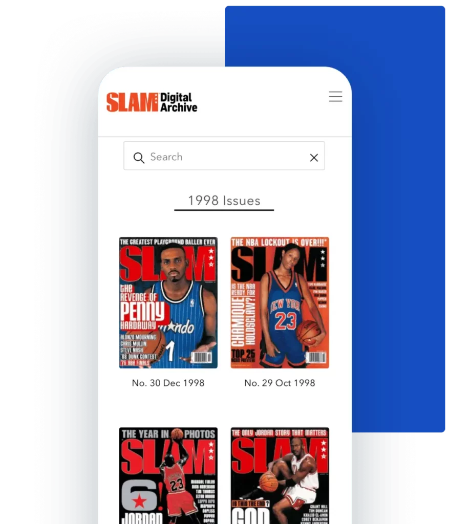
In this example, we see how basketball magazine SLAM has made their extensive library of back issues available to their subscribers. Readers can search by year, player, team, or topic to find all of the issues with relevant content. It’s not only a fun form of nostalgia, it’s also a lucrative way to capture mega fans of certain players or eras.
You can also offer access to all of the back issues of your magazine. Either offer this for free as an incentive to drive subscriptions for new content, charge per issue, or charge a one-time fee for access to the entire archive. The right strategy for you really depends on your target audience and other content offerings.
9. LOCAL Life
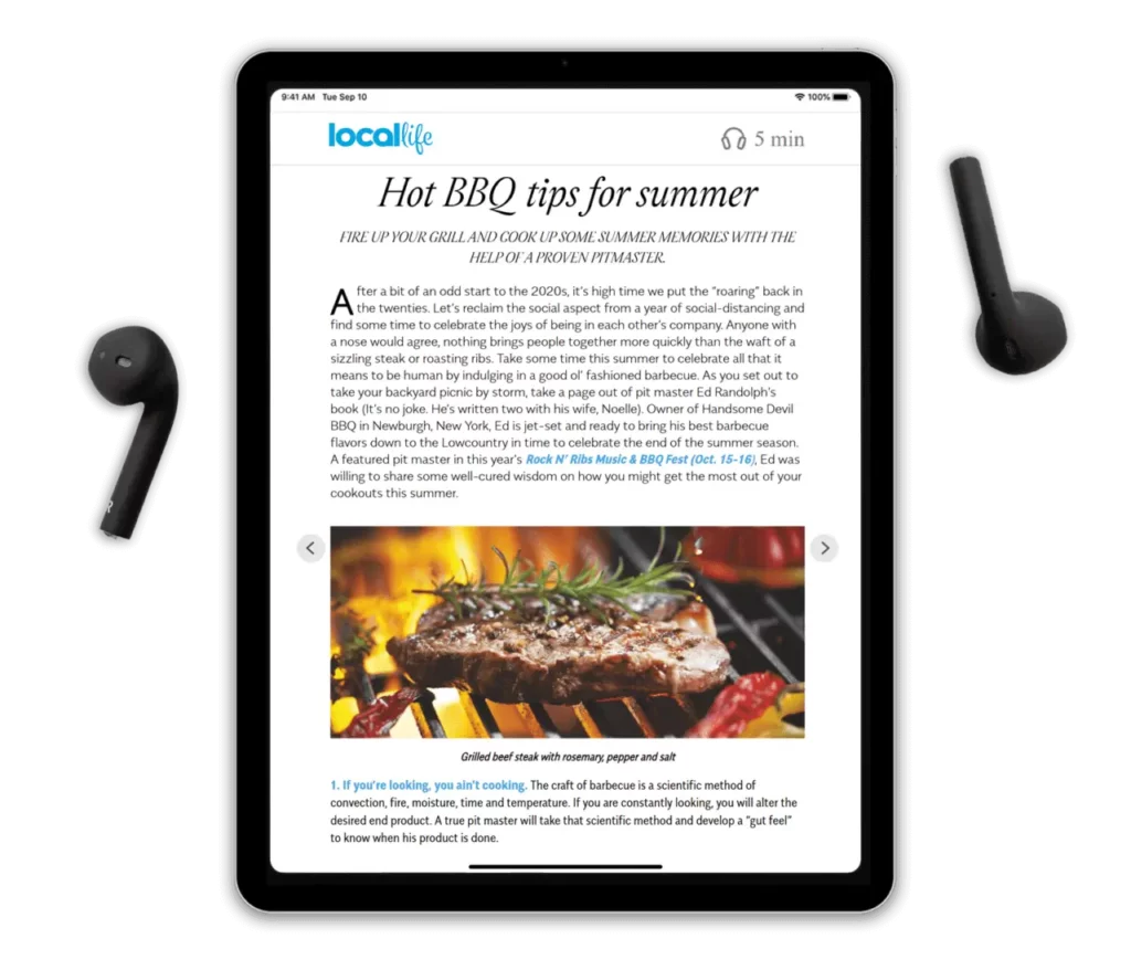
Serving Hilton Head Island and Bluffton, South Carolina, LOCAL Life is the regional go-to for restaurants, events, culture, and business news. As you can see, the magazine looks amazing when viewed in a tablet. As with our other best-practice examples, the single-column content and white background really allow the content to shine. Like Better Homes & Gardens, LOCAL Life makes use of realistic AI audio for easy audio generation.
Key takeaways from these digital magazine examples
It’s time to sum up all of the lessons learned! Here are some essential key takeaways when developing your own digital magazine:
- Responsive design: Truly responsive design looks great on computers, phones, and tablets without forcing the reader to pinch and zoom.
- Single-column content: Adopt a single-column layout for easy readability on any device.
- White backgrounds: Offer a clean and easily readable design.
- On-brand fonts: Maintain consistent branding through font style and color.
- Navigable table of contents: Create a navigable Table of Contents widget so readers have an easy way to navigate through different articles.
- Web-based magazine software: Unless you have a good reason to create a mobile app, opt for a web-based digital magazine for a great reading experience.
- Article audio: 73% of Americans listen to audio content monthly. Easily add audio to every article by using digital magazine software with AI audio generation.
- Full-width ads and images: In digital format, images and ads should be displayed full-width for great visibility, no matter how large or small they appear in your print magazine.
- Access to back issues: One of the best parts of the digital format is that readers can easily access your back issues. Make them available to subscribers for free or for an additional cost.
All of the above examples were created with eMagazines. Want to create your own mobile-optimized digital magazine without creating a mobile app?
Learn more about our mobile-optimized reader and get in touch with us to learn more.
